Abstract: This article discusses the three aspects of packaging and book binding, and the analysis of some box structures in packaging and book binding design. It is proposed that understanding and analysis of structures in books can be roughly divided into five types: Graphic creative type, functional type, material type, material symbol type, allegorical type, and detailed description of these five types.
Keywords: packaging, book design, boxing design, box structure, surface decoration, product styling, we start with the three aspects involved in packaging and book binding.
1. Structure: Good structural shape plays a crucial role in product protection. From the current market point of view, many packaging structures remain in the state of function and have not risen to the aesthetic requirements. A good structure should be a combination of function and aesthetics.
2. Surface decoration: surface decoration can be divided into brand fonts, graphics, patterns and so on. In this regard, the artist has more inspiration and talent. Brand fonts can be sacred calligraphic bodies, or they can be rigorous, sagacious variants of characters. Most of them can be designed in terms of metaphor, symbolism, or even block intrusion and segmentation. Graphics and patterns can be roughly divided into: the simplification of decorative patterns (logo design) and the addition of patterns (styling design of logos). The world of attached graphic patterns is very broad. There are symbolic paintings such as oil paintings, Chinese paintings, cartoon paintings, etchings, and pictures (photos), which can be concise or complex. Brand fonts, graphics, and trademarks should be placed prominently. Other ancillary graphics play a decorative role and can be made very small, but it is actually an overall and local relationship.
3. Product Modelling: At present, there are four styles of sprawl in the bottles sold on the market. The reason for the spread is because this style is not fully expressed, and the degree of recognition of businesses and consumers is more considered, but its overall guidelines should be correct. The degree of this idea depends on the designer’s own promotion, the recognition of the business, and the visual acceptance of the consumer. Personally summarized product styling features of the author are roughly divided into four categories: The first is the naturalist form, which is used more in ceramic art. It can be understood by combining the shapes of some Chinese ink paintings and Chinese freehand brushwork. It is asymmetric, flowing, casual and natural. The packaging of alcoholic liquor is a manifestation of this idea and the entry point of the business. The second is the embodiment of geometric forms. Most of these bottles are more formal and formal, and they formally change in form. The third type is a bottle-shaped design composed of a free-form curve. This design is smart, gentle, powerful, and adaptable. It is suitable for the design of women's products such as perfume bottles and cosmetics. The fourth is the use of traditional decorative graphics and decorative graphics of various ethnic groups in the bottle design. This graphic processing method follows the characteristics of standardized, conceptual, and stylized decorative patterns, and can handle the overall structure and local patterns of bottles. And design.

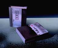
"Life Zen"
Let's talk about the analysis of some box-type structures in packaging and book binding design. In packaging design, we can create a multivariable box-type association by squeezing a box-shaped box, for us to box-type structure. Research provides great imagination. We can use this divergent thinking to carry out more structure and space imagination, which is conducive to creating more different forms of packaging design.
In the design of book binding, the most basic design is to use a straight line or a curved line to repeatedly combine and create boxes. By means of a straight curve, more structural shapes can be thought of.
In some alternative designs, some irregular shapes, if used well, can also produce some peculiar effects. This irregular shape can be designed and created based on the needs of the book itself.
The understanding and analysis of structure in book binding can be roughly divided into five types: 1. Creative graphic, 2. Functional, 3. Material, 4. Material symbol, 5. Implied.
Creative graphics. The traditional patterns and auspicious patterns of the Chinese nation have different patterns in each historical period. For example, the bronze patterns of the Shang and Zhou dynasty, the bricks of the Han Dynasty, the patterns of the stone paintings, the patterns of the Dunhuang frescoes, the frescoes of the Yongle Palace, the frescoes of the Fahai Temple, etc. all have strong decorativeness and flatness.
The decorative styles of the two river basins combine the features of Eastern and Western decorations. It is a fusion of Eastern and Western decorative styles. In addition, such as India's Buddhist murals, Egypt's right side of the law relief, Dunhuang Mogao Grottoes flying modeling, etc., but also have the characteristics of Eastern and Western decorative style, both realistic and flat.
For example: You can use the gothic architectural style decorative graphics for the "Notre Dame de Paris," the book box-shaped structure design. The decorative style of the Han Dynasty is ancient and thick. You can use the characteristics of the Han Dynasty decorative graphics to do structural design of the book binding and use the folk paper-cut style and various decorative styles to do book binding structure design.
Functional type. When it comes to functional structural design, we are more likely to think of portability and ease of use. The Germans' design focuses on functionality. A small notepad facilitates the use of leather and book stitching to make pocket-sized book designs.
Material type and material symbol. These two types of conceptual design are somewhat similar to three-dimensional sculptures, but they are not exactly equivalent to three-dimensional sculptures. They are more artistic in the design process. This kind of approach is close to the exterior design of some architectural designs, such as the Sydney Opera House. From afar, its shape is more like a big sailing boat; and if it is a bidding building for the Beijing Olympic Games, it uses the shape of the bird's nest to design; A building in the middle of the lake in Beijing’s Summer Palace, with a two-leaf paper moving appearance.
For example, the use of the characteristics of bamboo slips to design "Han", because the Han Dynasty People's Congress are using bamboo slips, this design reflects both the characteristics of the Han Dynasty, but also increased the design of the art. Have seen a northeastern black fungus packaging design, is the use of wood stakes material characteristics of structural scrutiny and creation.
For example, we can create creative designs based on different contents of a book, or we can use wire and other daily products and device materials to do different combinations of structural designs to fully convey the concept of books and the level of artistic taste.

Caozhou Laojiao Packaging Design
Allegorical design. This design can also be referred to as conceptual communication and conceptual continuity.
Taking the design of the book Zen in Life as an example, the Zen community talked about three aspects of human life. He said that in the first 30 years, the mountains were mountains, water was water, and in the last 30 years, mountains were not hills, and water was not water. In the next thirty years, watching mountains is the way mountains look at water and water. It is a process in which a person's thinking is constantly maturing and changing. Most of the young people are “only on the high-rise buildings overlooking the End of the Worldâ€, but in the end it may be “looking for him thousands of Baidu in the crowd, when you look back, the person is in the dim light.†This Zen insight, gradually understanding, pay attention to human beings The process of understanding. This type of design is called metaphorical design.
The box-type structure is roughly the same. Based on these principles, we can create more updated structural forms.
The following is a summary of the author's comments on the design of book binding design:
1. Pay attention to the design of book binding design and the development of creativity. In terms of structure, we must pay attention to the functionality and rationality of the book structure, as well as the aesthetic and artistic nature of the book structure, as well as the ingenuity and humanity of the design.
2. Pay attention to the arrangement of book layouts, the creative design of graphic patterns and the creative design of text graphics.
About the cover design, the author also summarized the following composition methods:
(1) The composition of point and line surfaces and the arrangement of layouts have different effects;
(2) Use of illustrations;
(3) Improve the advertising of the cover design with the use of isomorphism and imagery;
(4) The use of variant advertisements and the use of font design.
3. In the design and production process, workmanship is required, which is structured, precise and meticulous.
4. Some materials can be innovatively used, and high-quality materials can make the creative performance of the work more fully. This is particularly applicable to packaging design.
5. Pay attention to the overall effect of the work, the brand design of the book and the artistic taste and style of the design, and pay attention to the overall effect of the illustration.
6. Combine the isomorphism, specific variation, graphic imagination and other expression techniques in the plane composition to express creatively the cover design. This kind of avant-garde, alternative, is suitable for the creative design of some CD covers of Pioneer Music. You can also use some form of illustrations to cover the alternative literature.
Bold use of material properties and creative conceptual design are some of the new ideas I have in the field of packaging and book binding design.
Ou Yong Department of Fine Arts, Hunan Institute of Technology
Source: "Decoration"